Work
- Fresh milk substitutes like oat, almond, and soy are everywhere, but none can replicate the taste, texture, and consistency of fresh milk Tres Monjitas. We noticed […]
- During the COVID-19 lockdown, the kitchen became the home’s ultimate destination. Whether studying, working, or attending webinars, every break led to a snack. We turned this […]
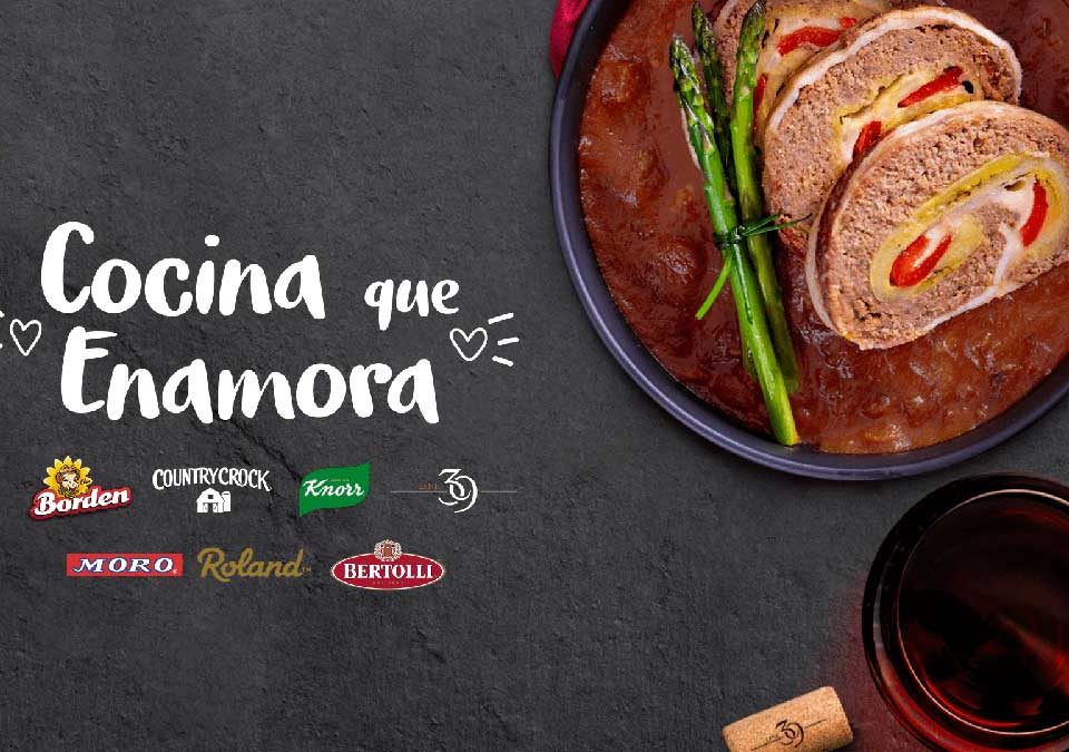
- Valentine’s Day is usually owned by chocolates and flowers. Our challenge was to make pantry staples relevant in a sea of roses. We created “Cocina que […]
- For the Gaia website redesign, we stripped away the clutter. We used the brand’s signature red as a bold graphic accent against a clean grayscale palette […]
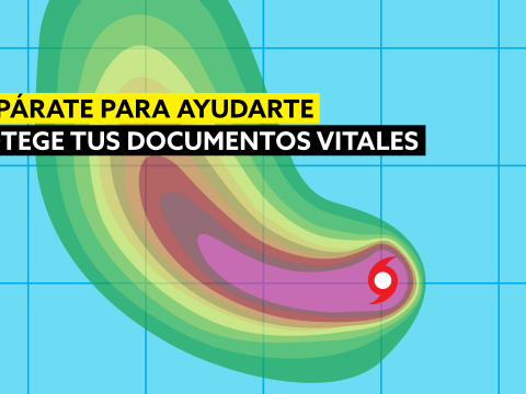
- People in Puerto Rico know how to prepare their homes for a hurricane, but they often forget to protect their most vital documents—the ones needed to […]
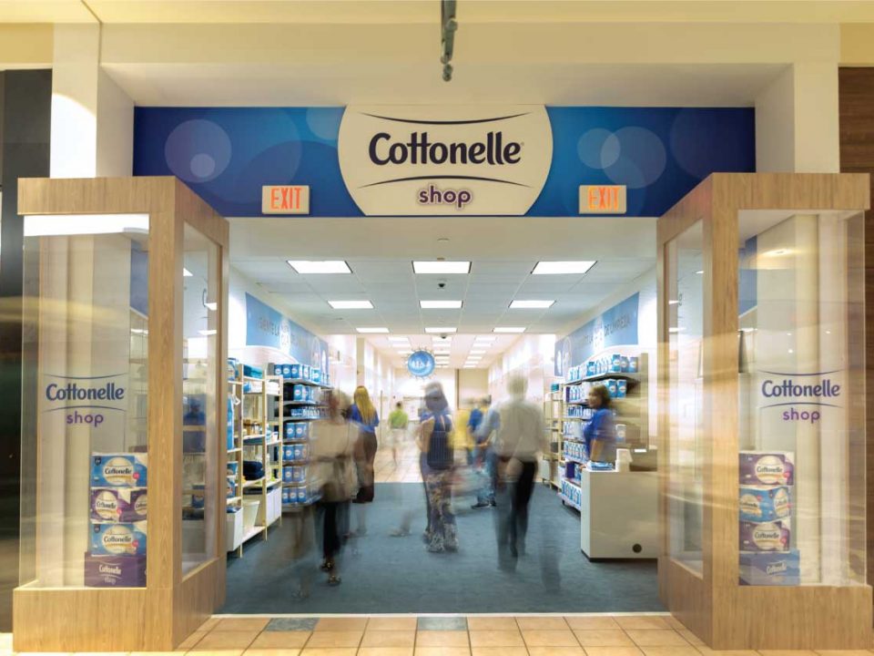
- Sampling toilet paper in a mall is a challenge. Our solution? Meet the consumer at the ultimate point of contact: the restroom. We transformed the restroom […]
- In a market flooded with cheap tire-shine imitations, Armor All needed to prove its durability. We executed an unconventional product integration during the historic Daddy Yankee […]
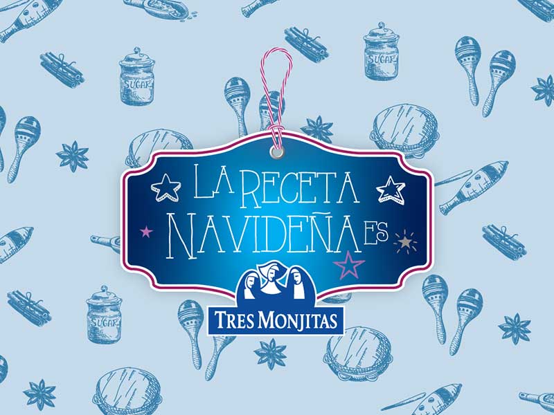
- To make dairy products relevant during the holidays, we created a specialized “Coquito Kit.” It included samples of every Tres Monjitas product, a recipe, and all […]
- Roof leaks are a common pain point in Puerto Rico. To position Gaco as the definitive solution, we moved away from technical specs and focused on […]
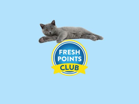
- We were tasked with growing the brand and standardizing the cat litter category at retail. We implemented additional space, standardized signage, and a custom reward app […]
- The holidays are the peak season for beauty. We collaborated with Coty Puerto Rico to develop a series of promotions for the CoverGirl portfolio. This included […]
- Keeping a car clean is a lifestyle. Armor All doesn’t just add shine; it creates a barrier. We developed a powerful 360 campaign that used visual […]
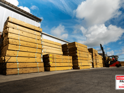
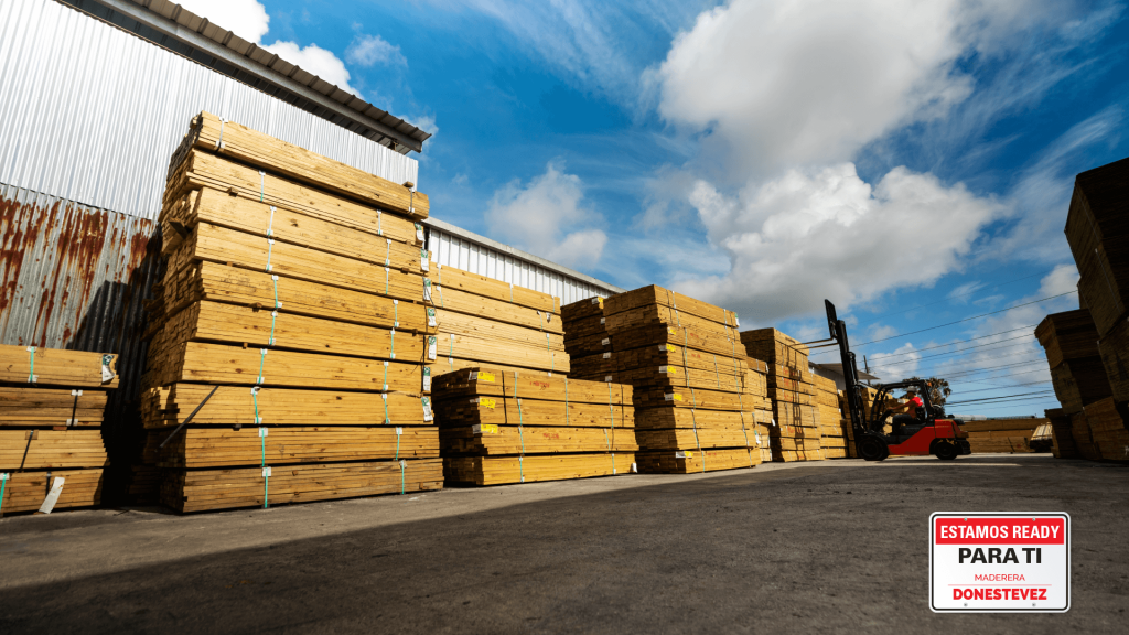
- Post-Hurricane Maria, construction surged. Our mission was to make Maderera Donestevez the #1 choice for contractors. The “Estamos ready para ti” campaign sent a direct message: […]
- For many, coffee isn’t a routine—it’s a ritual. “Tómate tu Tiempo” (Take Your Time) was designed for the consumer who refuses to start the day without […]
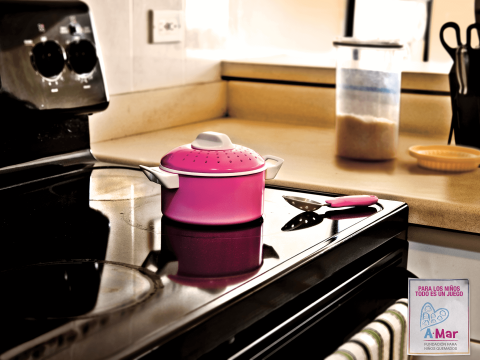
- To a child, a hazard looks like a toy. This campaign for Asociación AMAR was built to shift parental perspective. We developed a comprehensive graphic and […]
- La Noche de San Juan is a massive cultural event where crowds flock to the beach, but they often leave a trail of trash behind. We […]
- Grocery shopping is a chore, so we decided to reward it. We launched the new Tres Monjitas ice cream cones with a playful brand identity inspired […]
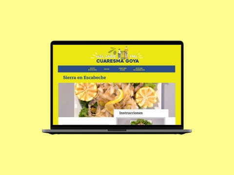
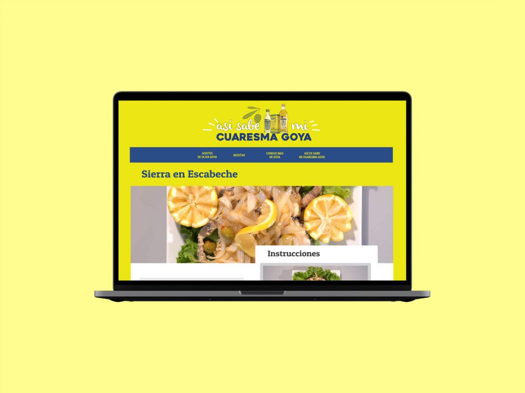
- Lent (Cuaresma) is when olive oil becomes a kitchen essential in Puerto Rico. We developed a campaign centered on traditional seasonal recipes, highlighting the versatility and […]
- Launching a movement requires more than a logo. For Revelarte, an e-commerce platform for Latin American art, we created a name that works in both English and […]
- Condal is a Barcelona-inspired restaurant. To reflect its menu, we adopted a minimalist aesthetic utilizing colors and graphic elements characteristic of Barcelona’s iconic design history. The […]
- We rebranded “Boricua Shoppers” into Shopperisimo—a name that is catchy, unique, and easy to remember. We defined the look with a “special price tag” icon and […]
- For JJ Ranch, the identity needed to highlight their “Brangus” cattle (a Brahman/Angus hybrid). We developed a clean illustration of the breed, paired with a sophisticated […]
- Strategy must be visible even in the simplest design. For Garcia Strategic Partners, we combined the family legacy (the “G”) with the ultimate symbol of strategy: […]
- We took the well-known Borges family heritage in livestock and applied it to their new spice and herb venture. The identity contrasts a bold typeface for […]


